


First impressions count right? And a website landing page can be the initial touchpoint your future customers engage with. Website landing pages are accessed through a range of sources but are commonly used now for SEO or targeted digital marketing campaigns, with pages containing key search terms that make your brand more discoverable against competitors. Let’s talk about the key principles to making a good landing page.
Direct, concise, to the point
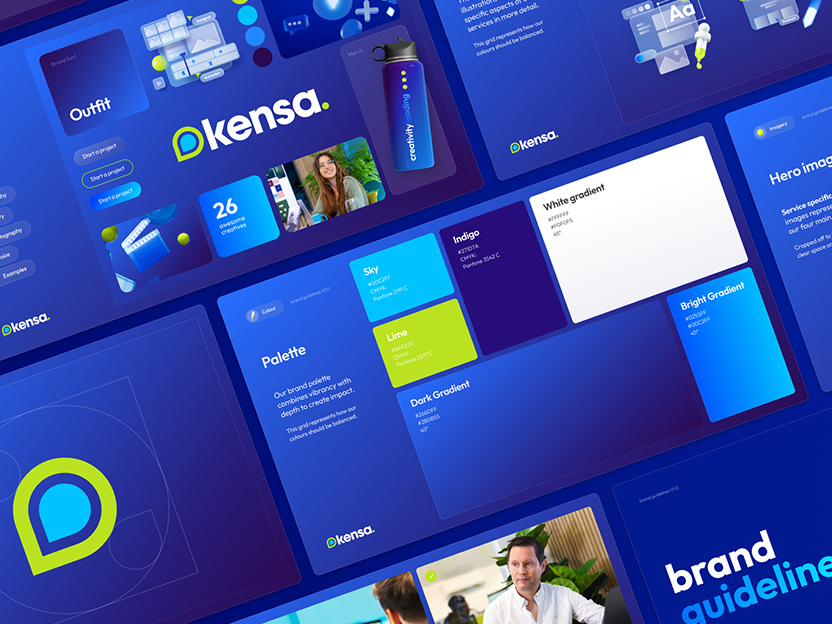
So, your website is expertly crafted (especially if you onboarded the Kensa team to design it) to achieve multiple goals. The key difference with landing pages is that they’re built with a sole purpose: to convert. The design of a landing page is direct in its tone and content, generally only focused on 1 offering. Why? Well, I like to put it like this: if you boarded a plane to Heathrow, you’re not going to be happy if it lands in Luton, are you?
A potential customer arriving at your landing page is looking for something specific, so it’s important that the landing page is relevant to their search to retain their engagement.
Successful website landing pages are specific
Start by being specific – what is your landing page aiming to convert? Have you got a forecast of how much you expect (or want) to increase conversions by? Are you targeting a certain demographic – and are you using the right channels to target them? Creating a specific goal shapes the content of your landing page, setting it apart from normal webpages with general messaging. For example, an objective “to increase enquiry form submissions of UK students living in Birmingham” allows you to create relevant copy speaking to this audience directly. Cut the generic jargon and focus specifically on the benefits that appeal to that target audience, doing so can increase conversion by 15%.
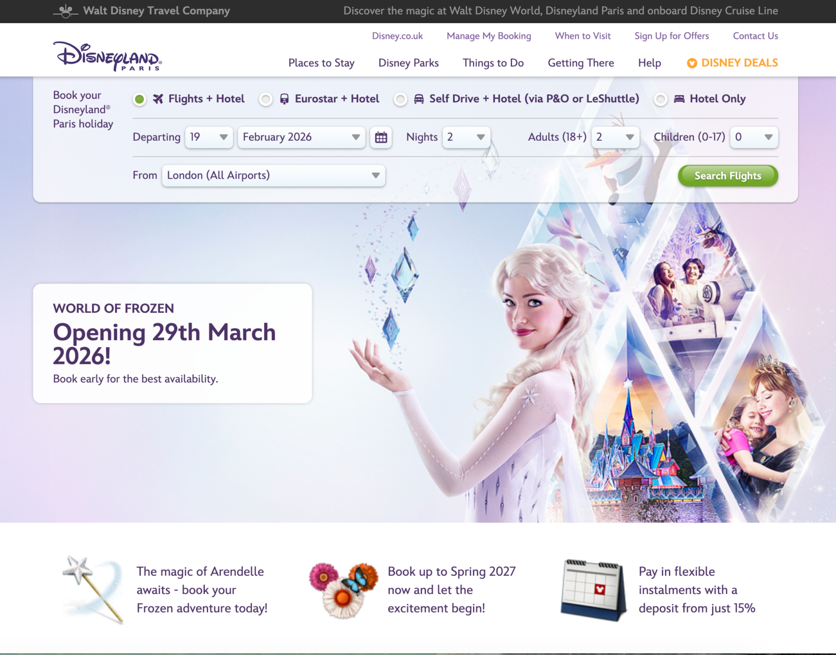
The Walt Disney Travel company do a good job of concise messaging. A form is located at the top of the page to support quick checking of at the top that checks flights and hotels, with a primary call to action communicating a new attraction opening. Further USP and sales copy includes messaging at the bottom to promote flexible paying options, making them more appealing and also making their offering seem more affordable. Positive, action focused messaging like: “Book your adventure today” makes it appear that the page is directly talking to you. In mere seconds you have all the information you need.
A clear path to convert
Is your copy written in a way that shouts out about the benefits to the target audience, but they still aren’t converting? You can have the best written landing page ever, but if your visitors can’t easily navigate to where you want them to convert, its fruitless. This is where design comes in. Any actions you want a user to take needs to be clear. Perhaps your landing page is for giving feedback or entering a prize draw – whatever the action is, you need to build the form for the input of visitor details directly into the launch page. It’s important that your customer also knows exactly what they’re expected to do on your launch page. Depending on the context of your landing page, buttons and messages such as “Buy now”, “Start my free trial” or “Let’s get Started” can drive a visitor to complete the desired conversion action.
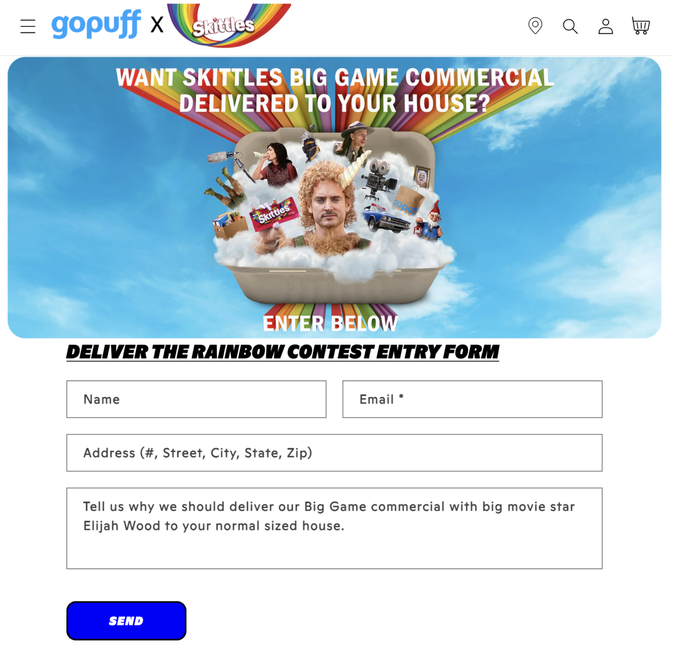
Skittles have done a great job in this promotion, with clear and bold text prompting the user to “Enter below”. There’s no barriers to entry as the form has been built straight in to the page, making it accessible and easier to understand for a wide audience. The visuals are also very memorable and on brand, surely to be remembered for a while.
Memorable visuals
It seems obvious but visual design makes all the difference when it comes to developing campaign landing pages – especially when making first impressions with potential new customers. People remember up to 65% of visual information three days after viewing, but will only remember 20% of written content. Visuals should encapsulate the core message your campaign is trying to communicate. For example, icons can represent key features, or a news website trying to recruit subscribers may have imagery of recent articles, visually representing their coverage.
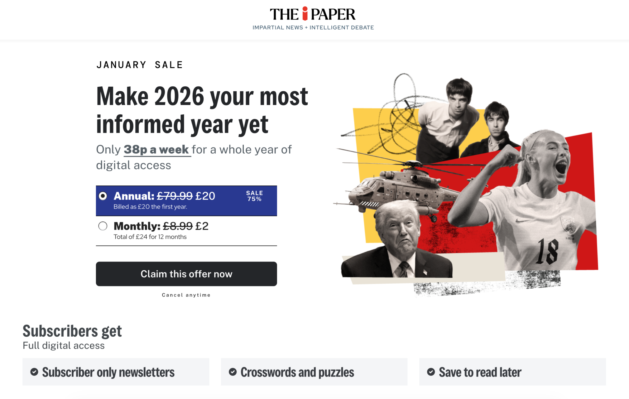
The iPaper shows that a white background can work in making a visual statement. Your eyes are drawn to visuals showing clear coverage of world news, music and sports as a focus. There’s also a subscription option auto selected, so users can be signed up in seconds by clicking the claim button.
How Kensa can help
We can help develop a website landing page from the ground up. We will create strategic copy, design unique visuals – we can even help with SEO optimisation . We’re here to ensure your marketing campaigns (even if you don’t need a landing page for success) are ready to beat out your competitors. Get in touch with us to discuss your plans in more detail. Ready to get going? Start a project with us now.