


Sure, mobile web optimisation isn’t something new. It’s common place to ensure your website is responsive and appears correctly in portrait aspect ratios for all device types. The form factor of our devices has however begun to change drastically, therefore so does web optimisation for mobile. But why is mobile phone web optimisation is changing, and what are the solutions to ensure your website is optimised correctly?
Why is mobile web optimisation important?
A blog in the Kensa archives from 2016 is surprisingly still relevant today. Simply, most users now access websites through their mobiles and as a result, the Google algorithm lists web pages optimised for mobile higher on search results. It avoids customer frustration. Nobody likes navigating an awkward website, so brands looking for a new site, or to enhance their current website should approach web design and development with mobile devices in mind first.
The fold factor
This is probably one of the biggest factors that is changing mobile web optimisation, the dawn of the foldable phone. Unbelievably, the first foldable phone was released in 2018; the Royole Flexpai, which was dismissed as a poorly designed fad.

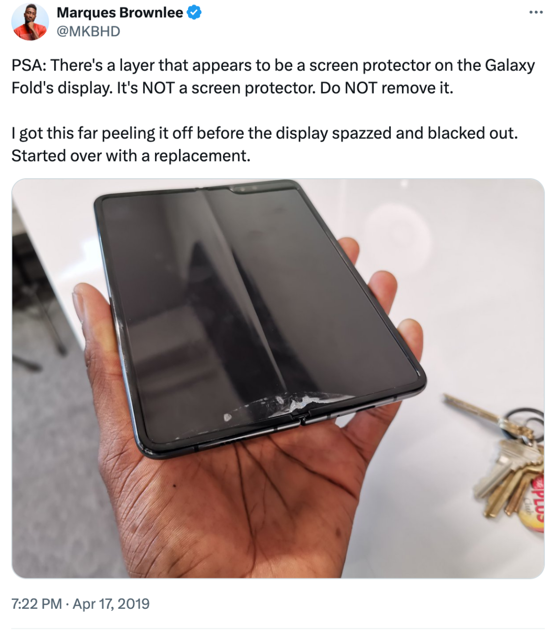
It’s no surprise that the tech in its infancy faced a lot of issues. Samsung’s first generation of their foldable mobile device in 2019 equally had teething issues. Its initial role out to celebs led to a delay of releasing it to the public. Those with hands on the phone were rendering it unusable, ripping off screen layers they believed were screen protectors, and getting debris in the hinge.
Flashing forward to 2026, the previous tech woes plaguing the market are now a thing of the past. Samsung have firmly established that foldable phones are here to stay, with a record 32% growth in shipments towards the end of 2025, and the overall foldable phone market growing by 14% year-on-year.
There’s further confidence in the market with Samsung expanding their foldable range to include the Galaxy Tri-fold (a phone that has 2 hinges on it to house a foldable 10 inch display) and rumours circulating of Apple’s first foldable iPhone releasing in 2026. Effectively this opens up the possibility for devices to take a multitude of form factors, greatly extending screen ratios beyond the traditional 16:9 optimisation.

Narrower and taller
For some, they might be thinking: “I don’t need to worry about this, most people don’t have foldable phones yet”. Sure, its an emerging market, but appearances can be deceiving. Whilst every other phone may look the same, they aren’t. And ignoring a mobile-first approach is why many brands may find their audience engages less with their site due to functionality issues, poor late and a simple lack of UX from a mobile perspective.
Smart phones previously had screens with 16:9 widescreen ratios, but consumers wanted more. Once phone processors became multi-tasking media consumption juggernauts, users wanted as much screen as possible on their device. This led to manufacturers getting more experimental with how they could extend screen sizes, whilst maintaining the same phone footprint.
This thinking led to the development of the “notch” (selfie cameras embedded into the screen) and Apple’s dynamic island on iPhone. This has greatly changed the standards of website optimisation for mobile, with no standard longer fit for all.
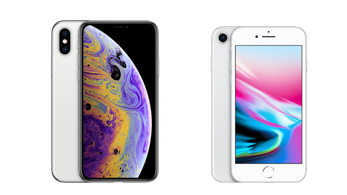
The iPhone 8 (pictured top right) released in a similar timeframe to the iPhone XR (top left). You’ll notice that these devices in terms of size look very similar with one key difference – the iPhone XR’s screen extends directly from the top of the device to the bottom. This drastically changes the aspect ratio between the devices from the common standard of 16:9 on the iPhone 8, to 19:5:9 on the iPhone XR, potentially changing how websites display on the screen.
How can you optimise a website for every screen?
Well, thats a very good question. It’s actually simple in practice. There are two types of optimisation for mobile web optimisation; responsive and adaptive design. Adaptive design is a webpage that’s made from templates fitting specific screen ratios. Your web server will then load the appropriate template for that device. Responsive web design is a universal web page made for one specific screen size that will cleverly alter the page elements to fit the device screen exactly. Responsive web design effectively means your website is future proofed for whatever screen ratio is required by the user.
How Kensa can help?
The mobile and web landscape is continually changing but at Kensa, we’re on top of it. We’ve got over 15 years of web development experience, whether you have bespoke optimisation requirements or need our recommendation, we’re here to take care of it.
During our website project process, we design everything with both desktop and mobile in mind. And, then the time comes for build, we approach it in exactly the same way. Functionality and user experience is considered from all devices – including our own internal testing of sites at UAT stage. This way, we can ensure that your brands online presence is always visible as intended, providing the best possible experience for your audience.
Ready to bring your website into 2026? Learn more about our web services, or get in touch to discuss your project.