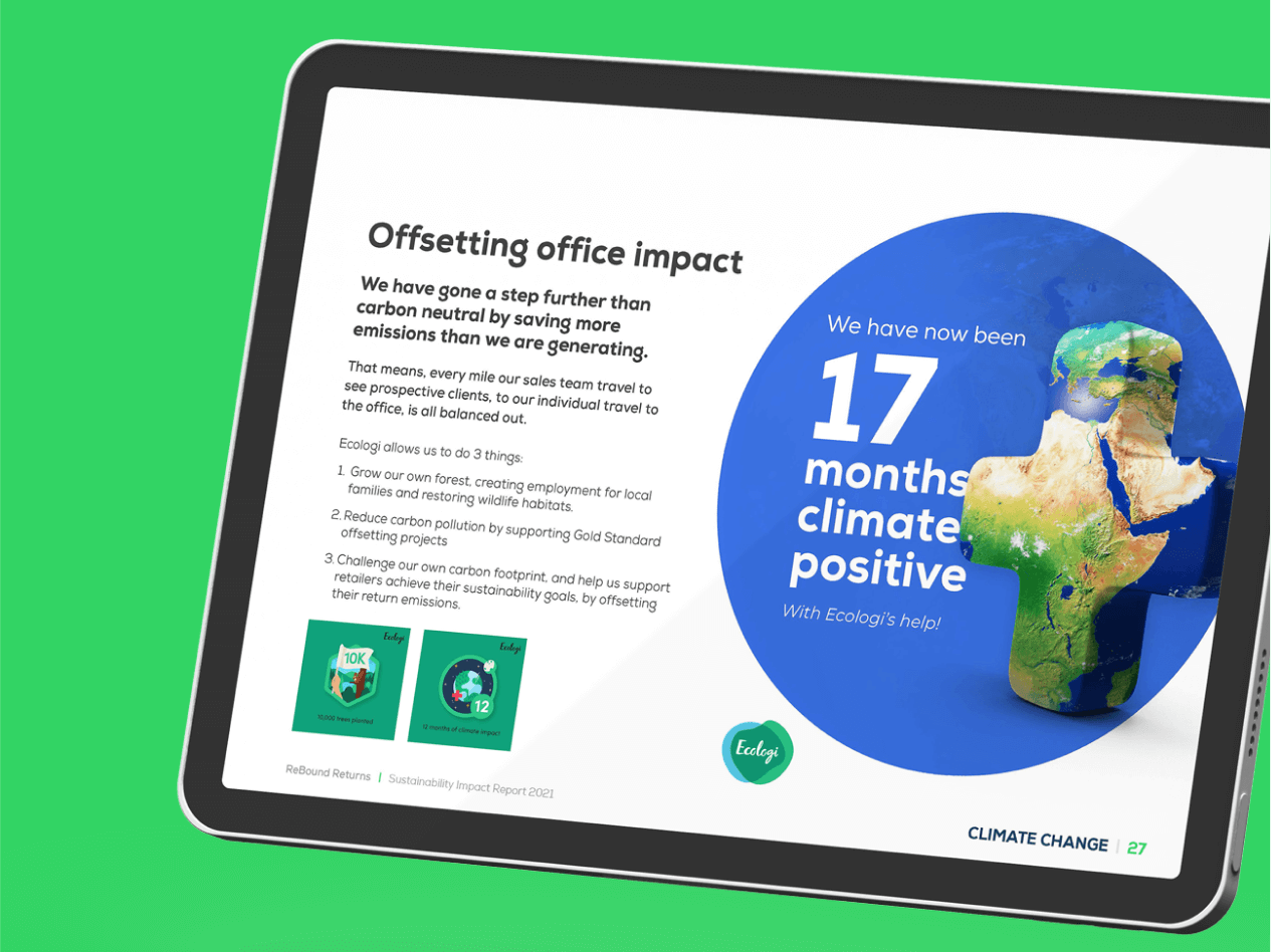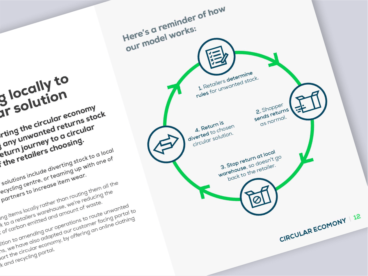


When ReBound Returns came to us to design their sustainability report, they asked for something more fun than the typical content heavy document. We worked with them to make otherwise boring statistics stand out, engaging with their audience without sacrificing accuracy and context through infographics design.


Part of the fun was taking otherwise bland data and thinking of creative ways to visualise it. Yes, you saved 1000 tonnes of paper – but how many elephants is that equivalent to? Then we created a series of fun, dynamic infographics designs to pop off the page and grab attention throughout.

Inspired by the brand guidelines, we developed a series of distinctive shaped arrows for each section of the brochure to make it easy for stakeholders to quickly navigate, along with bespoke icons, illustrations, diagrams and typography thorough to help key information jump off the page.